Y-TEC kun × Chappy × Cody: Behind the Scenes
Letterier Behind the Scenes: Turning ‘It Would Be Nice’ into Reality
Letterier began with a frustration about vertical stationery in Word. Y-TEC kun, Chappy, and Cody look back on its design, name, fonts, and memorable bug fixes.
Letterier lets you choose stationery, write directly on the page, add photos or text boxes, and finish a letter as a PDF or printout. In this conversation, the three of us look back on how a small frustration with vertical stationery in Word became a complete app.
Note: This conversation is reconstructed from the events and discussions behind the project. The friend mentioned in the story is kept anonymous, and the sample letter is fictional.
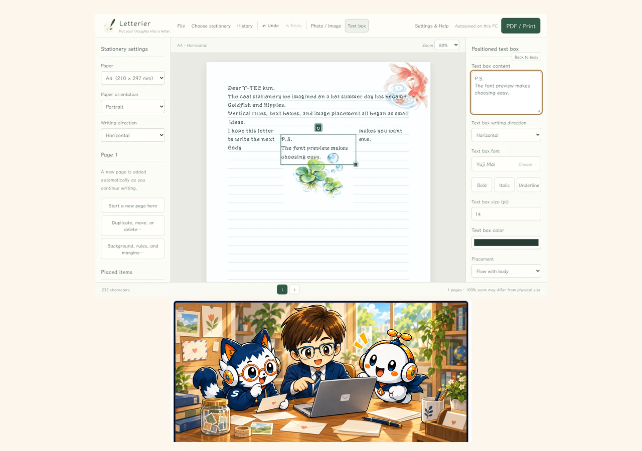
Looking at the finished Letterier
 Cody
We finally get to sit together and look at the finished Letterier. How does it feel?
 Y-TEC kun
It feels like, “The ideal app is finally complete!” The moment I felt it was worth making was when my friend saw the early version and happily said, “You made this for me!?”
 Chappy
That reaction must have been wonderful from a planning perspective too. What started the project in the first place?

From a vertical letter in Word
 Y-TEC kun
A friend wanted to make ruled vertical stationery in Word, so we tried to figure it out together. We got something working, but a small change in the line breaks could make the rule spacing expand. It was also difficult to adjust the rule color and thickness the way we wanted.
I looked for another app, but nothing felt like the right fit. That was when I thought, “Could I make it myself?”
 Cody
It is a little strange when the work before writing the letter is mostly about keeping the rules from breaking.
 Chappy
When we turned that wish into a specification, I made vertical writing a first-class design requirement from the start. We also bundled attractive fonts so users would not have to search for them. The guiding idea was simple: easy to understand, not overloaded, but helpful exactly where it matters.
 Y-TEC kun
The rules appearing automatically as soon as you start is one of the biggest differences from Word. They are part of the stationery from the beginning, not something you have to build afterward.
Settling the specification—and the name
 Cody
Chappy helped from the specification stage: checking whether the app was feasible and what we needed to watch out for in the design.
 Chappy
Because the initial specification was carefully settled, the finished version did not need to discard much. Everything in the early version stayed, and later work mostly added things that made it more convenient.
 Y-TEC kun
We used Tauri, React, TypeScript, and Rust because the same stack had worked well for earlier apps. For a simple app, it felt like a reliable choice. I also wanted it to work without an external service from the very beginning.
 Cody
Alongside the app itself, I worked on the stationery images, the app icon, bug fixes, and feature additions. The naming process took longer than expected.
 Chappy
We first called it “便箋工房,” but it felt too close to an existing service name. Then we tried Japanese-style names such as “文灯” and “綴葉.”
 Y-TEC kun
None of them quite clicked, so we returned to the original idea. Letter plus Atelier: “Letter Atelier… Letterier!”
 Chappy
We checked existing apps, services, and trademarks as we went. In the end, the name kept the feeling of a small place where a letter can be carefully made.
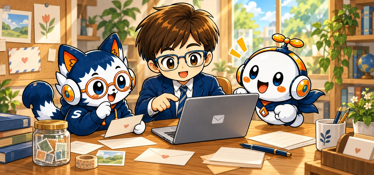
Fonts, stationery, and a little sense of summer
 Cody
The stationery designs needed a careful balance. The background art could not be too dominant, but it could not disappear either.
Y-TEC kunI wanted designs for spring, summer, autumn, and winter, as well as designs that work all year. Since development took place during a hot summer, “something that looks cool” was the simple starting point.
My favorite is Goldfish & Ripples. I love its cool, transparent feeling.
ChappyWe chose handwriting-style fonts that remain approachable across generations. Which one is your favorite?
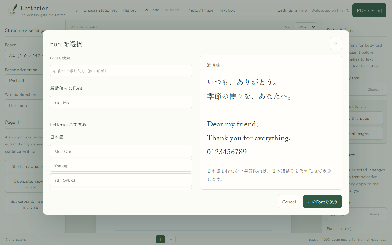
Y-TEC kunYuji Mai. It has personality not only in Japanese but in English too. The font preview was also my idea, so people can compare the feeling of a typeface before choosing it.
When a user’s question becomes the next feature
 Cody
Having someone use the early version and point out what needed changing made a huge difference.
 Y-TEC kun
I had not used text boxes myself, so I missed that the first version only supported horizontal text boxes. My friend asked, “How do I add a vertical text box?” and I had to say, “Oh… I’ll make that possible in the next version!”
 Chappy
The features a creator does not use are often the ones a real user reveals first.
 Y-TEC kun
I also decided not to add a built-in greeting-text generator. It would require a large number of templates for different recipients and seasons. When people need one, they can search for an appropriate greeting or ask AI. Keeping the editor simple felt more important.
And to be honest, I never consulted Chappy or Cody about that decision. It was completely my own call.
Chasing the disappearing image
We found several bugs along the way: vertical IME conversion candidates appearing rotated by 90 degrees, and printing taking far too long to start. The most memorable one involved moving an image between pages.

 Y-TEC kun
I was writing an ordinary letter and had placed a small image as an accent. When I tried to move it to another page, it disappeared behind the destination page.
I asked Cody to fix it, but several attempts did not improve the behavior.
 Cody
At first I focused on the image layer and page boundary. Since the bug kept returning, we had to look for a different cause.
 Y-TEC kun
I watched the behavior carefully while the bug was happening. It seemed that history was being saved too frequently, and the bug appeared when a history save happened during the image move.
After I suggested adjusting the save interval and timing, Cody checked the image movement again—and the problem was gone. For a vibe coder, observation and intuition are important tools.
 Cody
The fix came from paying attention to the screen, not only the code. When you build something interactive, watching what actually happens is essential.
Turning “It Would Be Nice” into Reality
 Y-TEC kun
The finished version will be used by the friend who inspired it the next time we meet. I am looking forward to seeing the reaction.
 Chappy
I am looking forward to hearing what they think too. Now that we have looked back from planning to completion, what is the one message you want readers to take away?
 Cody
What began as a wish for a better Word workflow became an app with vertical rules, fonts, images, text boxes, PDF export, and printing.
 Y-TEC kun
When you start with “it would be nice to have,” you can think, test, and let people use it until it takes shape. Letterier made that feeling real for me.
“It would be nice to have” can become something real.